This essay is based around the design structure of a website for a videogame production company called Square Enix, a Japanese firm well-known for producing technologically superior games for a lucrative market.
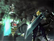
To begin with, the designer/s behind this website design have decided to incorporate a black-coloured background, which frames a large screen-like apparatus at its centre.
Upon closer inspection of this screen, it becomes quite apparent that the site's designer/s have opted to include just such a feature in order to mimic the shape and range of a television or computer screen.
Given that Square Enix is a mass-market company whose expertise lies within the visual arts, it is obvious that this mechanism was employed to signify the nature of their product as a company which produces visual media that can most often be viewed through a screen.
However, not only does this symbolically reference their videogame software, it also serves to create a symbiosis of the screen you must use to survey the webpage and the screen you must use in order to view their extensive software catalogue.
The aforementioned black sheen that coats the webpage's design also serves to embolden the high-colour images that are clearly arrayed within the central screen, but black is also a very strong, often bleak colour that may suggest more about the site than would be commonly assumed.
For me, the colour black represents strength and superiority, and perhaps makes a bold statement left unspoken by the company itself that may allude to its own reputation as a high-brand corporation well ahead of its peers.
The Square Enix logo, which is located in the upper left-hand corner of the screen, is a highly-stylized emblem that provides a hint as to how the company managed to become known by such a strange name.
Formerly, Square was once a sole brand recognised as Squaresoft in the United States and abroad, and another software company involved within the same industry, Enix, was a household name all its own.
The two companies had largely different styles and catered to separate consumer bases, with Squaresoft pioneering new games that featured innovative gameplay styles and complex specifications, while Enix focused their attention on developing less technical games with emphasis on traditional gameplay mechanics.
Squaresoft has since purchased Enix, and the two companies are now an amalgamated force that remains one of the largest companies within the videogame development industry. This amalgamation brings us to the single most important feature of their website's design - the company logo.
To begin with, the Square-Enix logo is kept tucked away in the upper-left corner of the screen, followed by "North America", signifying that this website is connected to Square-Enix's American branch. Looking closer, the website's surveyors will espy that both the 'e' in Square and the 'E' in Enix share small red dashes, clearly symbolizing the close union between the two companies.
Secondly, the blatantly futuristic lettering of the logo gives the viewer a close approximation of Square-Enix's style and attitude toward videogame production, with the company clearly intending to have users associate Square-Enix with futurity and high quality videogames that may come to define the future of the industry.
Below the logo, several boxes are arrayed above the central screen-like device, each alotted its own task, collectively functioning as the website's toolbar. Within these boxes and adjacent to their written functions are pictures that help to further direct the user through the website, which shows not only dedication to ease-of-use, but also as further indication of Square-Enix's underlying visual sensibility.
Another advanced feature of this site that I've yet to see reproduced by other websites is the addition of another scroll bar located at the base of the screen-like device. This bar allows the user to scroll through a number of further links to the latest products produced under the Square-Enix umbrella, each of which is represented in high-colour/resolution images that spring up onto the screen device in the website's centre.
Overall, it is obvious that Square-Enix is a company epitomised by lavish visual splendour, the highest of high quality production values, and an almost self-conscious air as it carefully goes about maintaining its reputation in each of these areas. They are a forward-thinking, future-oriented company that wants its target demographic to evolve along with it by manipulating their tastes and interests, ensuring a constant influx of consumer growth and staying power well into the future.
And with just such a website as its storefront, they may be seeing many more customers to come...
By Nathan Saul.
Reference List:
About Me
- Nathan Saul
- While I'm not usually forthcoming about my private life, I suppose in the interests of higher education that certain details be less enigmatic. For one, I'm now 22 years-of-age and feeling more than slightly past it - though I take particular care in maintaining my skin. No sniggering! I'm also partial to the odd videogame now and then, so long as it refrains from the typical big-guys-with-big-guns formula. Anime/Manga (no Naruto, please!) is another of my hobbies, though writing is definitely my preferred time-waster. I live in South Auckland (again, no sniggering!)and have a pet cat, named Chilli, capable of inflicting evil-looking scratches. There, now you known something about me - so kindly stop asking!